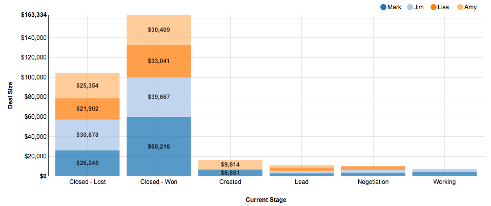
A stacked column chart displays one or more measures represented by a bar for each value by grouping, broken up in turn into a section per stack grouping.

In the above example, the stacked column report is displaying the sum of sales by current stage, broken out by sales rep.
You can also display stacked column charts with a grouping along the X axis and one or more measures making up the stacks. After you've selected Stacked Column Chart as the report type, click on the Customize link next to the Report Type button and choose 'Multiple Measures as Stack Fields'.
The following properties are set in the Report Editor -> Additional Configuration -> Edit Properties -> Color Scheme.