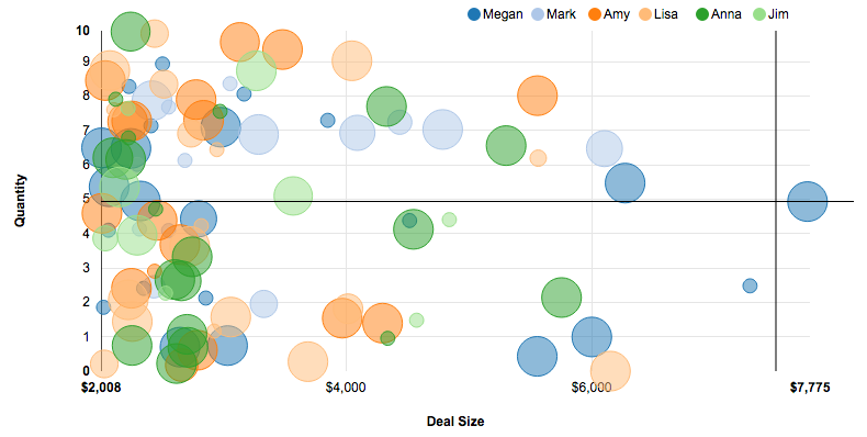
A scatter chart draws one point for each grouping, plotted by a measure or date on the X and Y axes. You can optionally include another measure for point size and another grouping for different colors on different points.

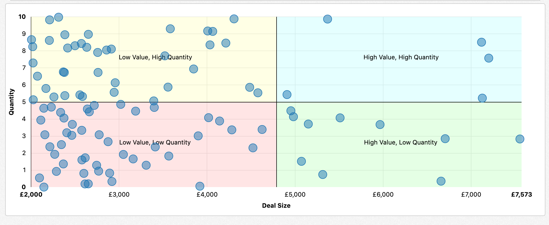
You can customize scatter charts to include background highlighting per quadrant and to include a label per quadrant:

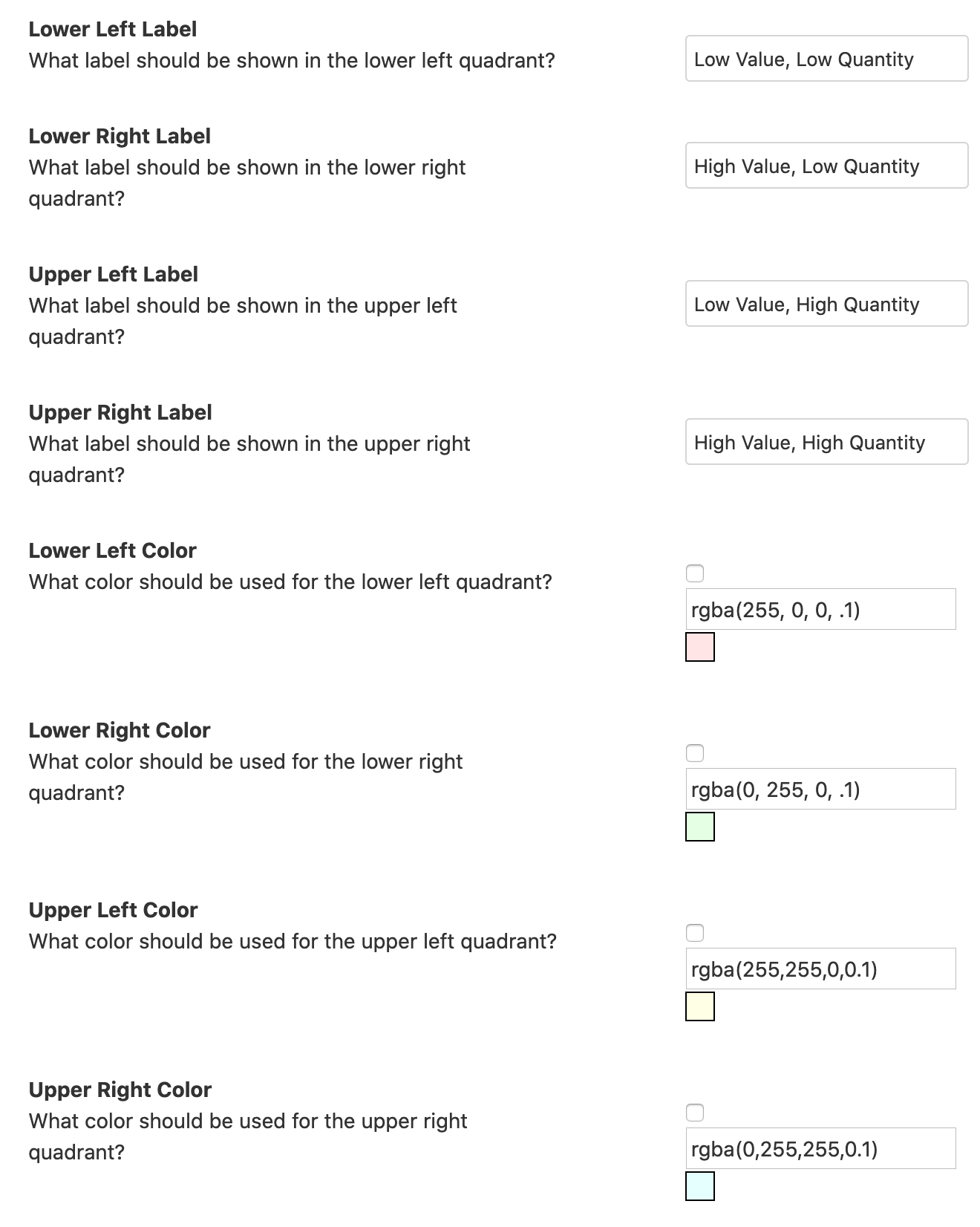
To enable these sections, go to Configuration -> Report Properties -> Formatting in the report editor on the chart. Scroll down to the following section:

You can customize labels, colors, or both.
The following properties are set in the Report Editor -> Additional Configuration -> Edit Properties -> Color Scheme.