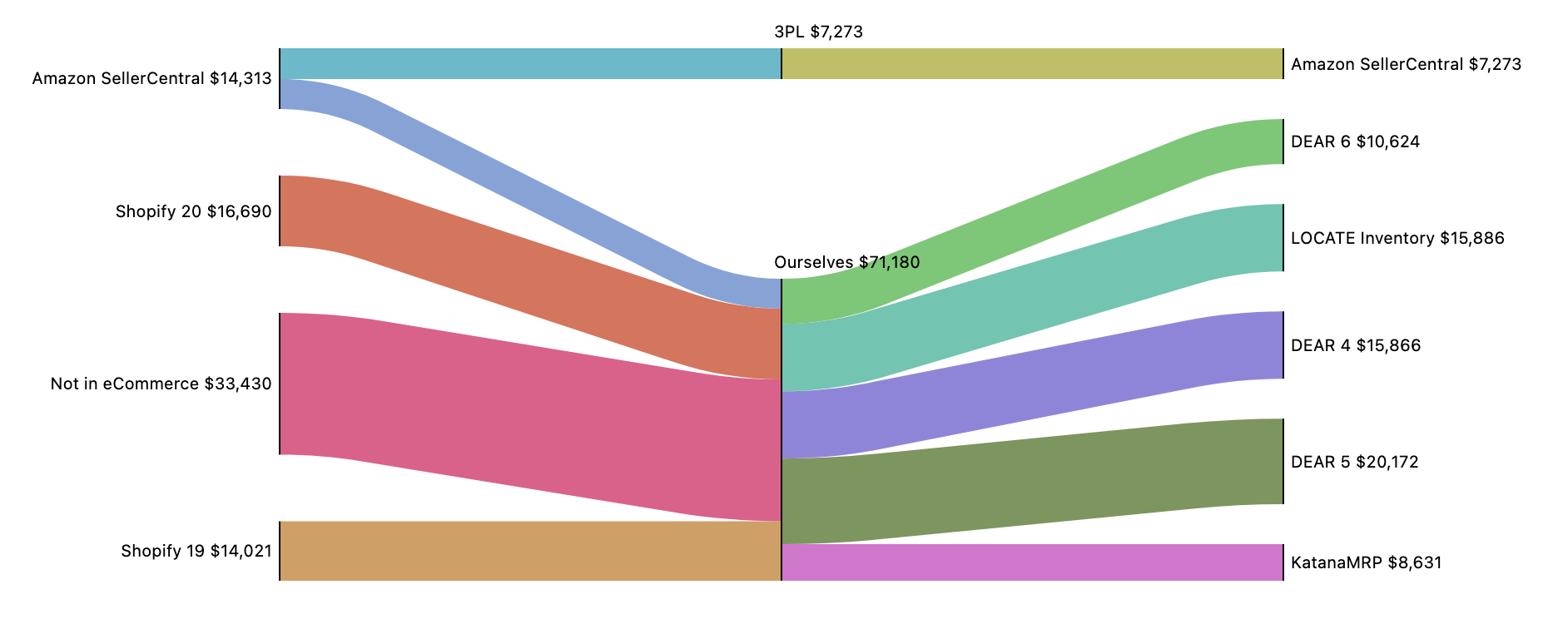
Sankey diagrams help you to see the relative flow of a value as it goes across multiple systems or stages. For example, you can look at your order volume going through multiple storefront services, break it out by 3PL and your own fulfillment systems, and look at the amount fulfilled by each end system as in the example below:
Easy Insight provides two types of sankey diagrams. For the first, you'll need at least two Groupings and one Measure. Each Grouping represents one point in the flow of data, while the Measure is what is calculated as the flow in the diagram:

For the second type, you provide an initial value such as a gross sales total, then each additional measure subtracts from that initial value:

The following properties are set in the Report Editor -> Additional Configuration -> Edit Properties -> Color Scheme.