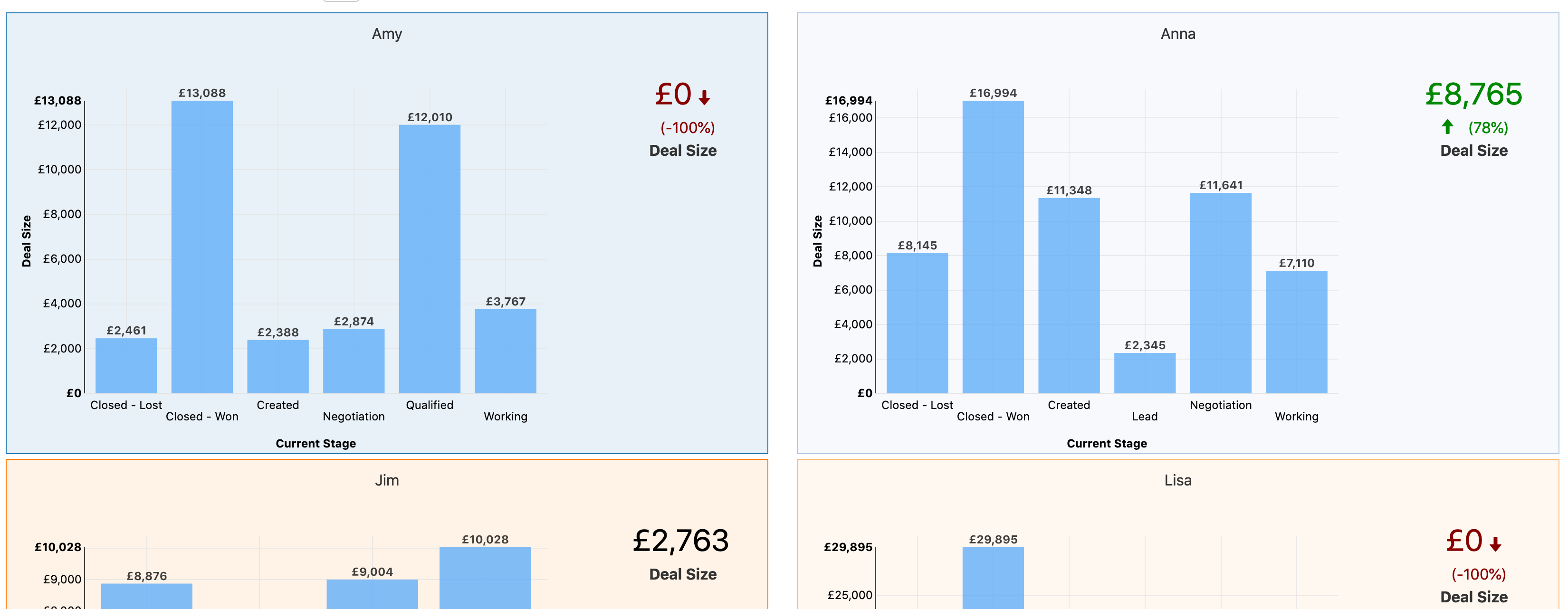
Repeaters enable a single report or a grid of reports to be repeatedly displayed on a dashboard, once per value. For example, you might want to show a gauge for every sales rep or a chart for every project.
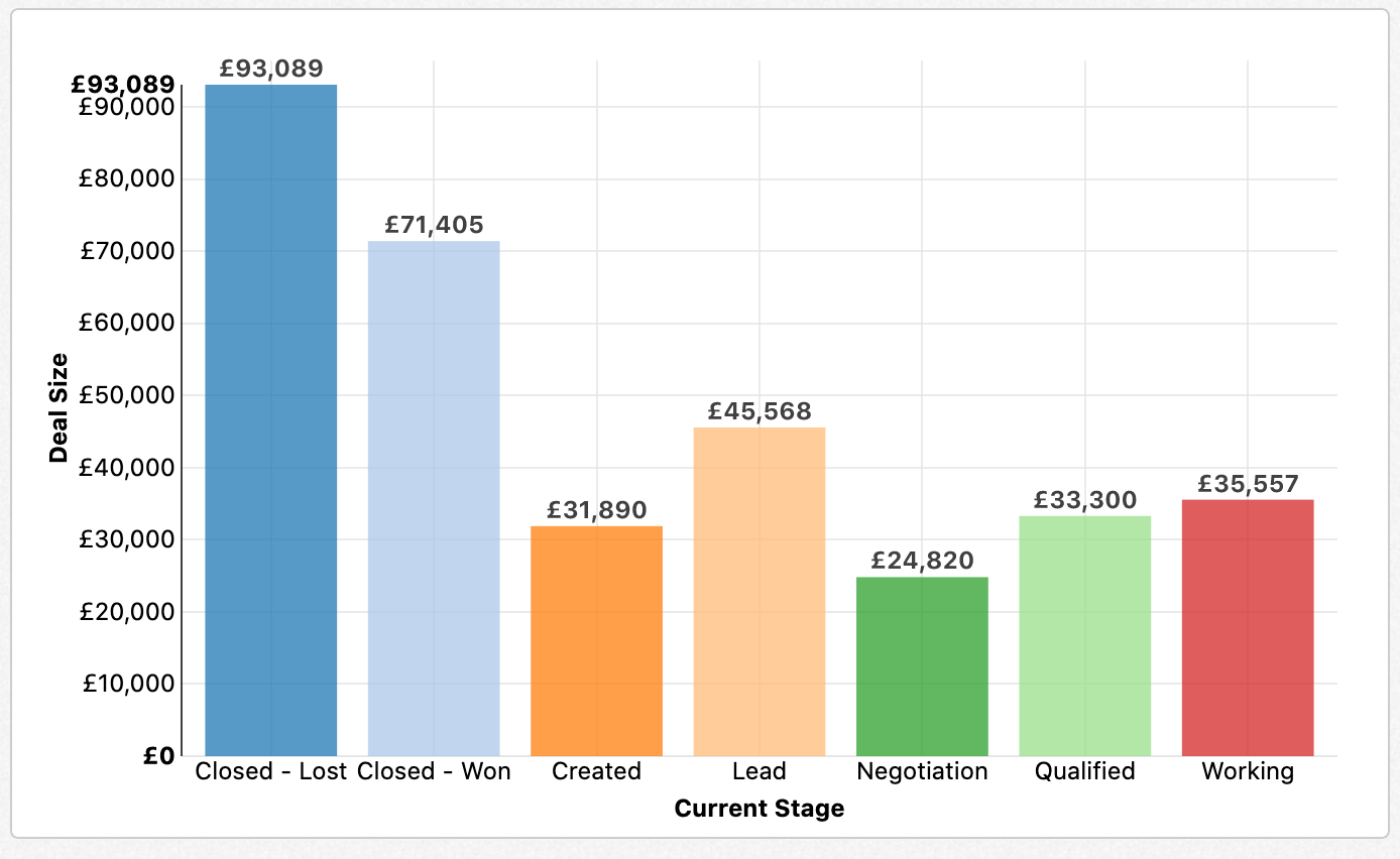
For this example, we'll take the following chart, showing sales by stage, and display it per sales rep:
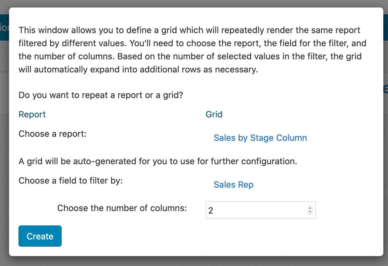
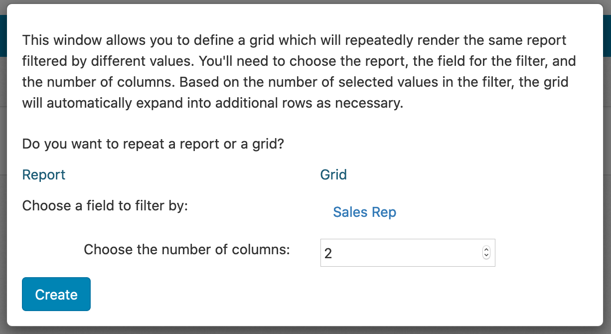
To start with, drag the Repeater control from the left hand set of dashboard controls into the dashboard. You're prompted to choose whether to repeat a report or a grid. For this example, choose Report. Next, you'll need to select the field by which to repeat the report--for this example, using sales rep. Finally, you'll need to choose the number of columns--typically, you'll want to use a number between one and four:
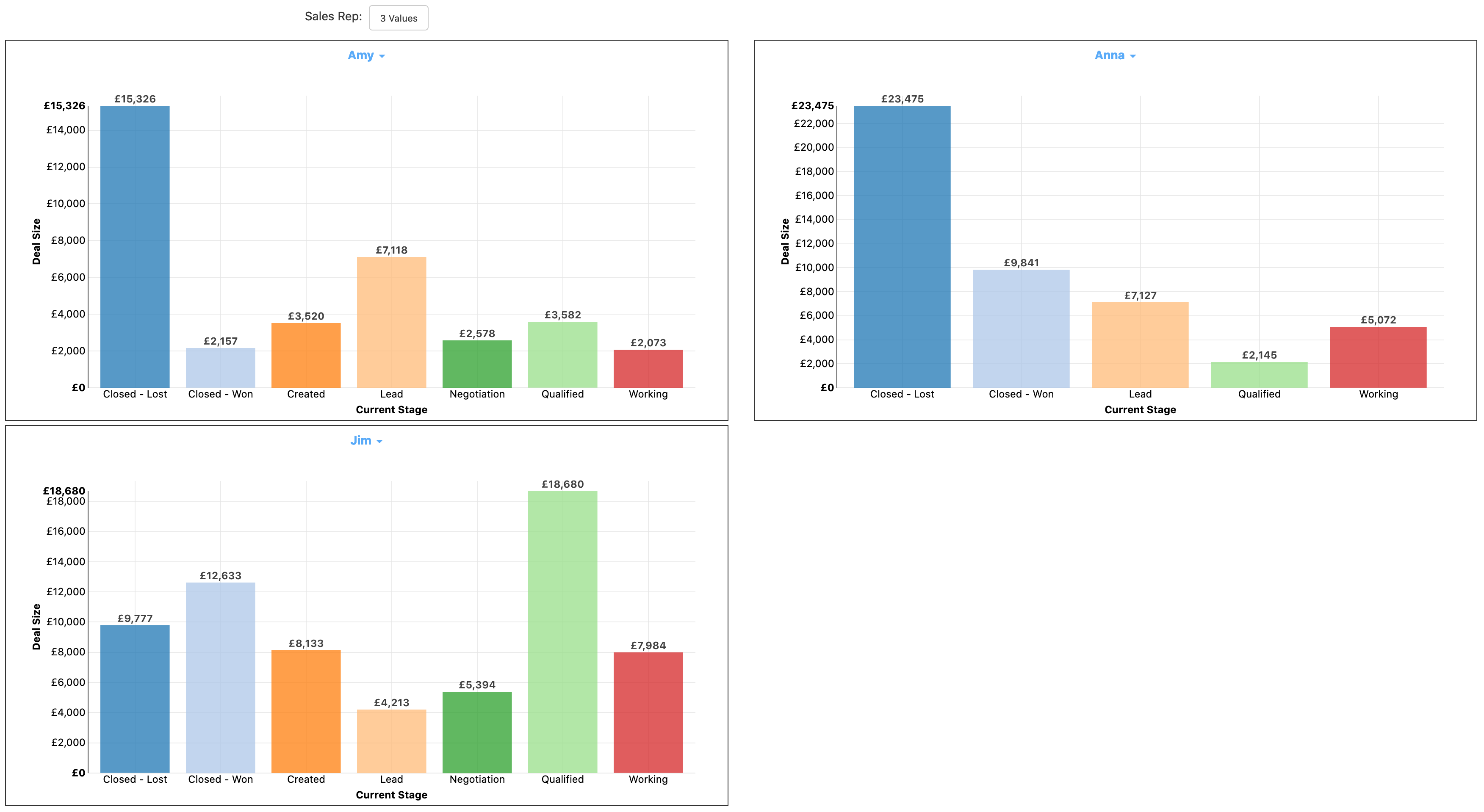
When you save the dashboard and look at the end user view, you'll see the report repeated for every value of sales rep as shown below:
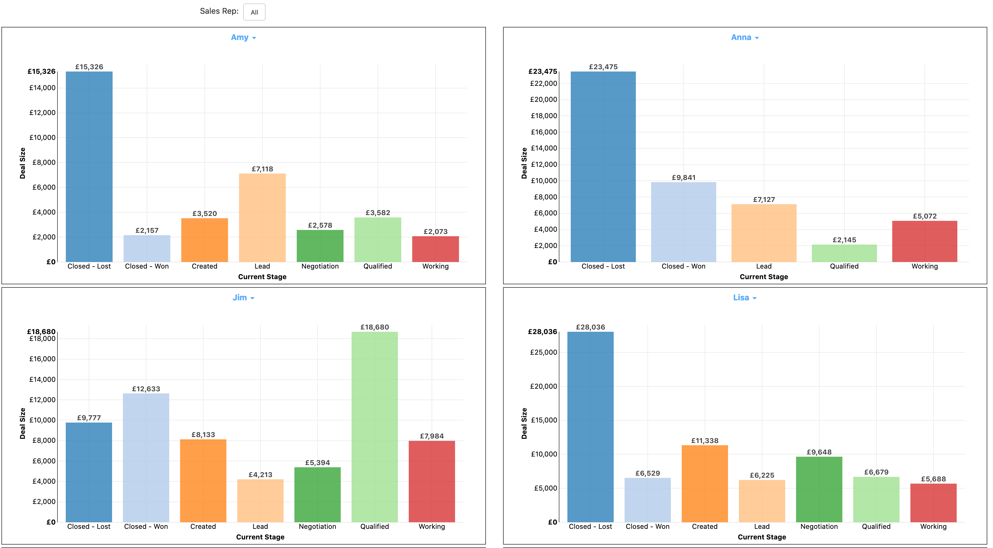
If you adjust the sales rep filter, the dashboard adjusts accordingly to only show the filtered values:
You can also repeat a grid of reports as opposed to a single report. We'll display our same column chart of sales by stage and a trend report. We'll also need a text report to act as a label on the grid. To start with, we'll create the text report as shown below, displaying the sales rep name:

With the text report created, you can set up the repeater again with a new dashboard, but choosing Grid as the option this time. Specify Sales Rep as the field and choose the dimensions again:
Set up your grid of reports in the dashboard as you normally would--in this case, the text report is on the top, with the column chart and trend report below:
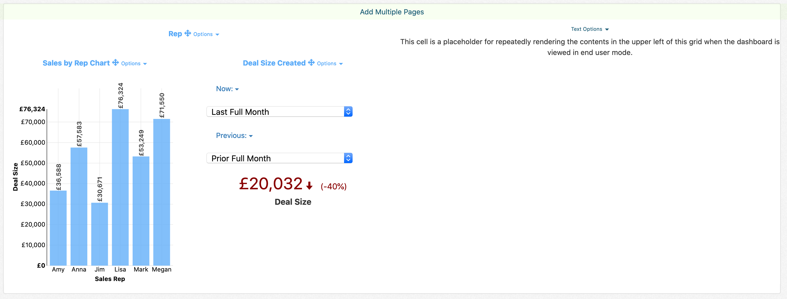
In the end user view, the dashboard displays as below:

You can customize the formatting of this display in several ways. If you've defined a color lookup table on the field it'll automatically apply the color as the background to each grid section:

You can also get rid of the border around each report to make the end dashboard display as a little more cohesive. Click on the Options link next to each report and toggle the 'Hide Border' setting on the report:
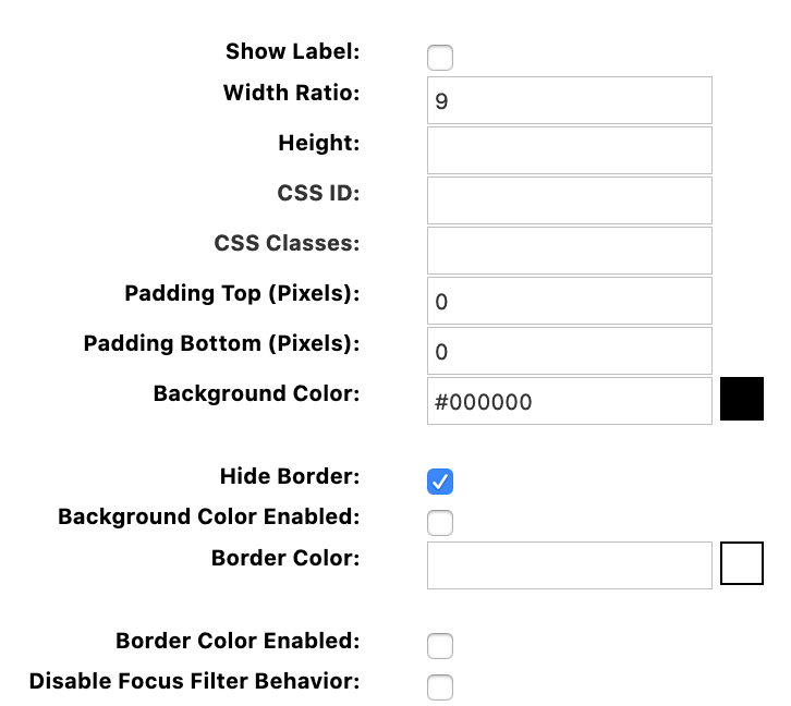
With the border hidden, the end user shows as the following:
